Ernie Films
Visual Identity.


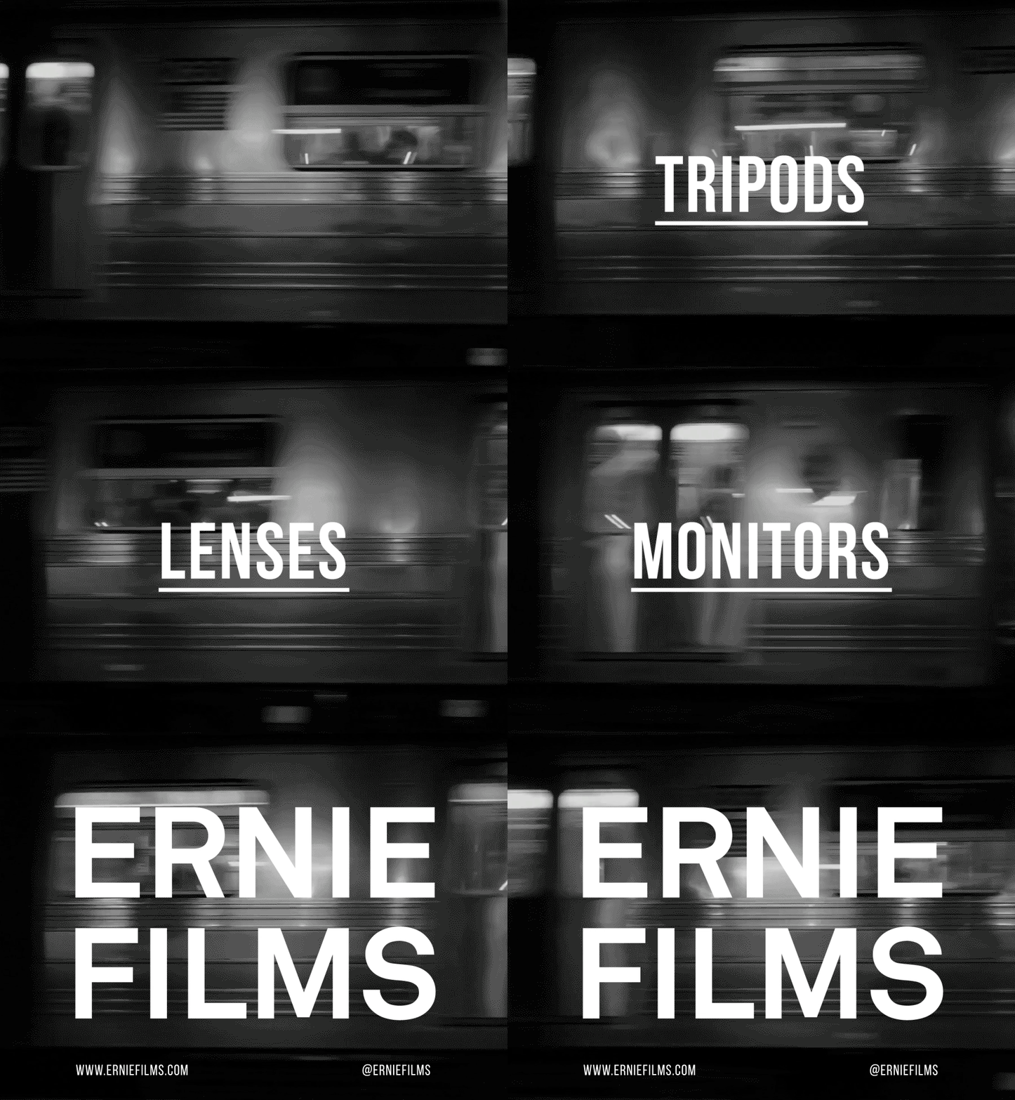
Old Spitalfields Market
Campaigns for Old Spitalfields Market.


Studio Yolk
Visual Identity for content creator, Studio Yolk.


Music Clients
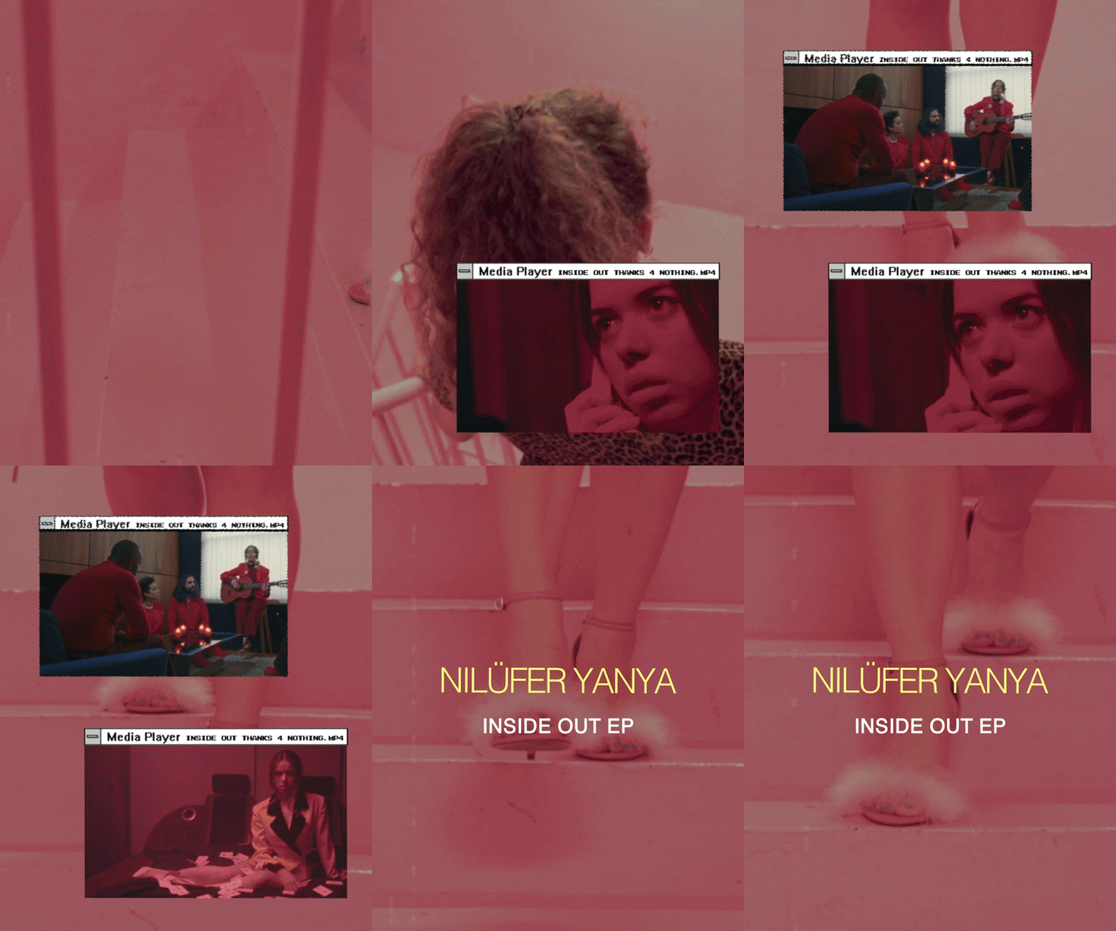
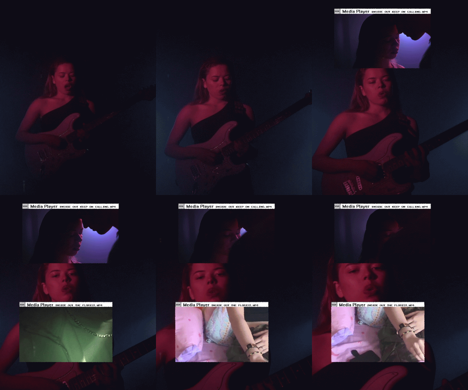
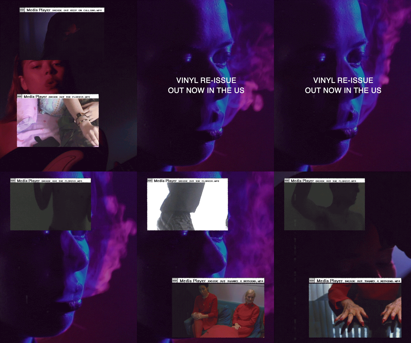
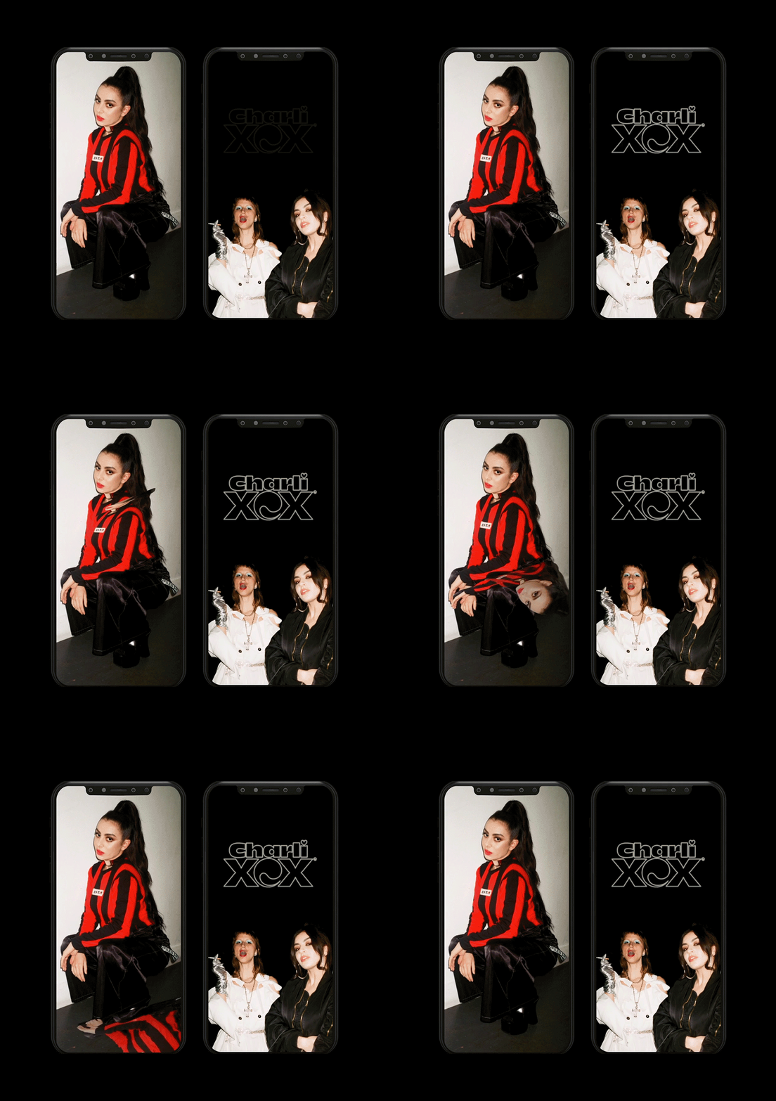
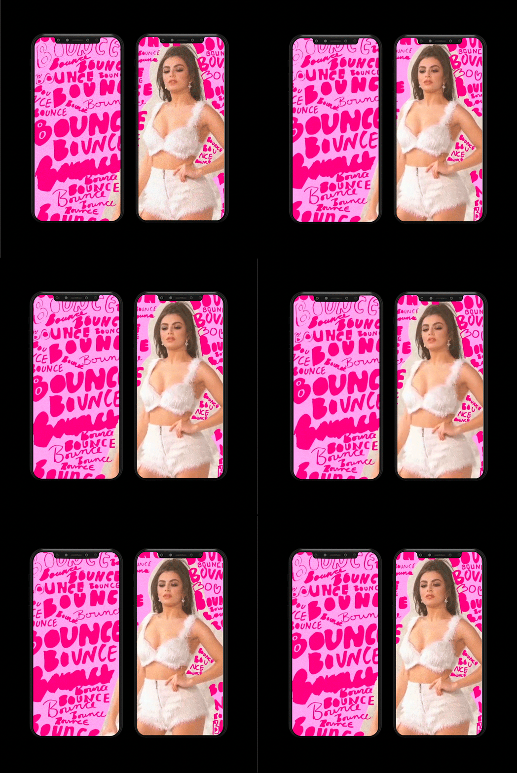
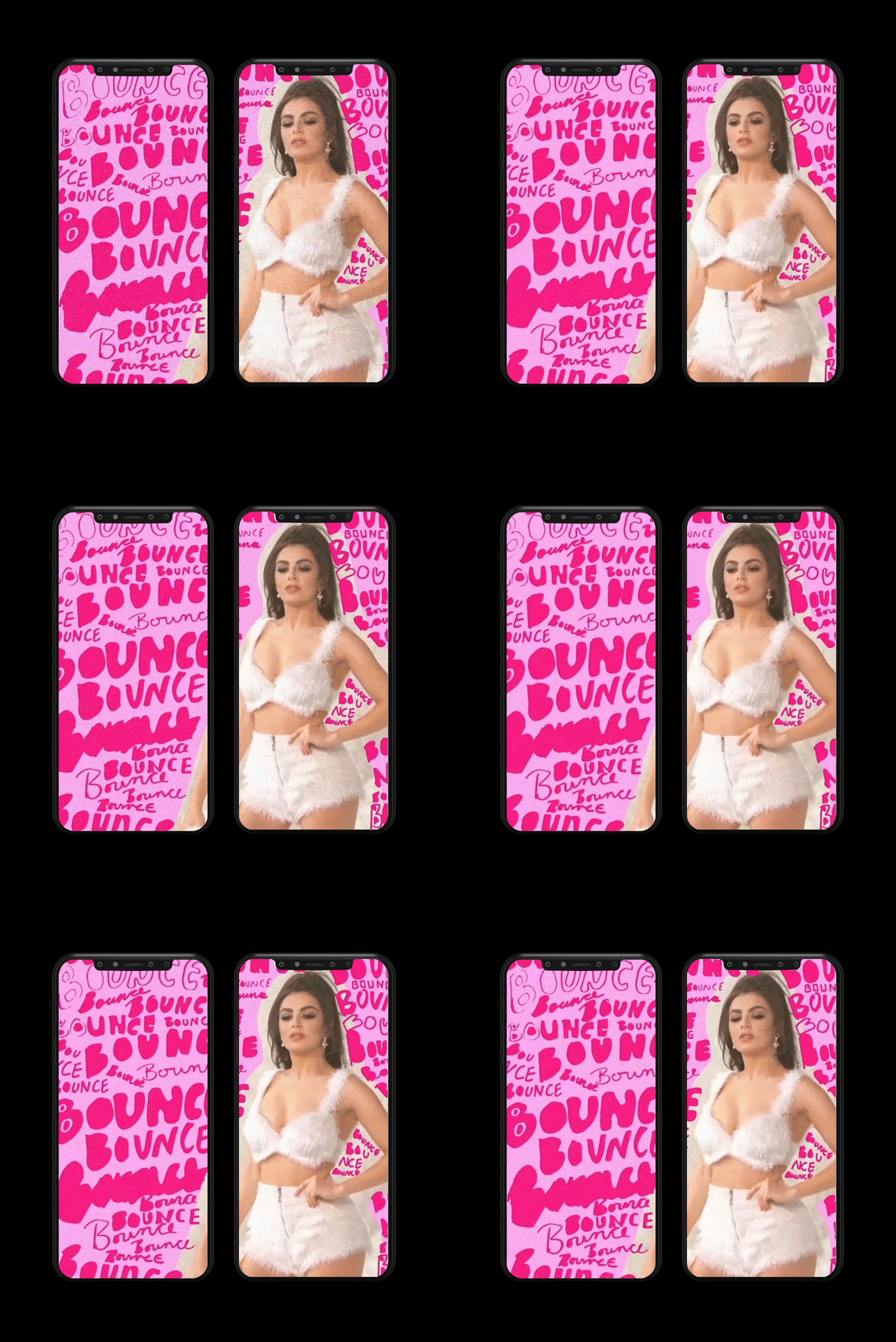
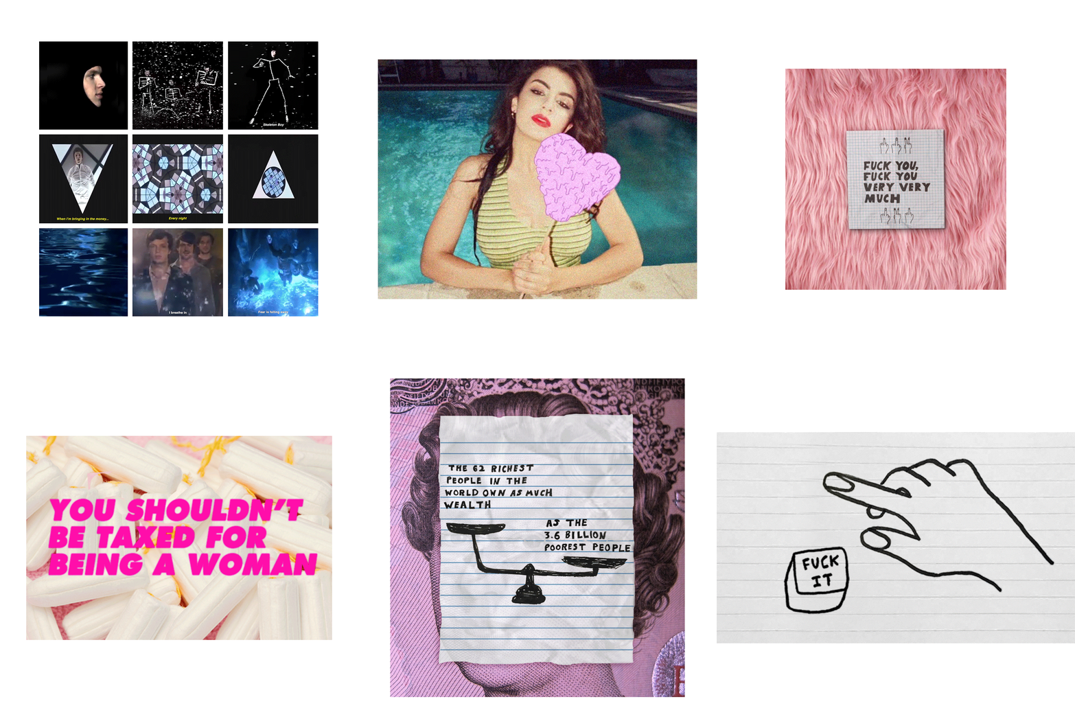
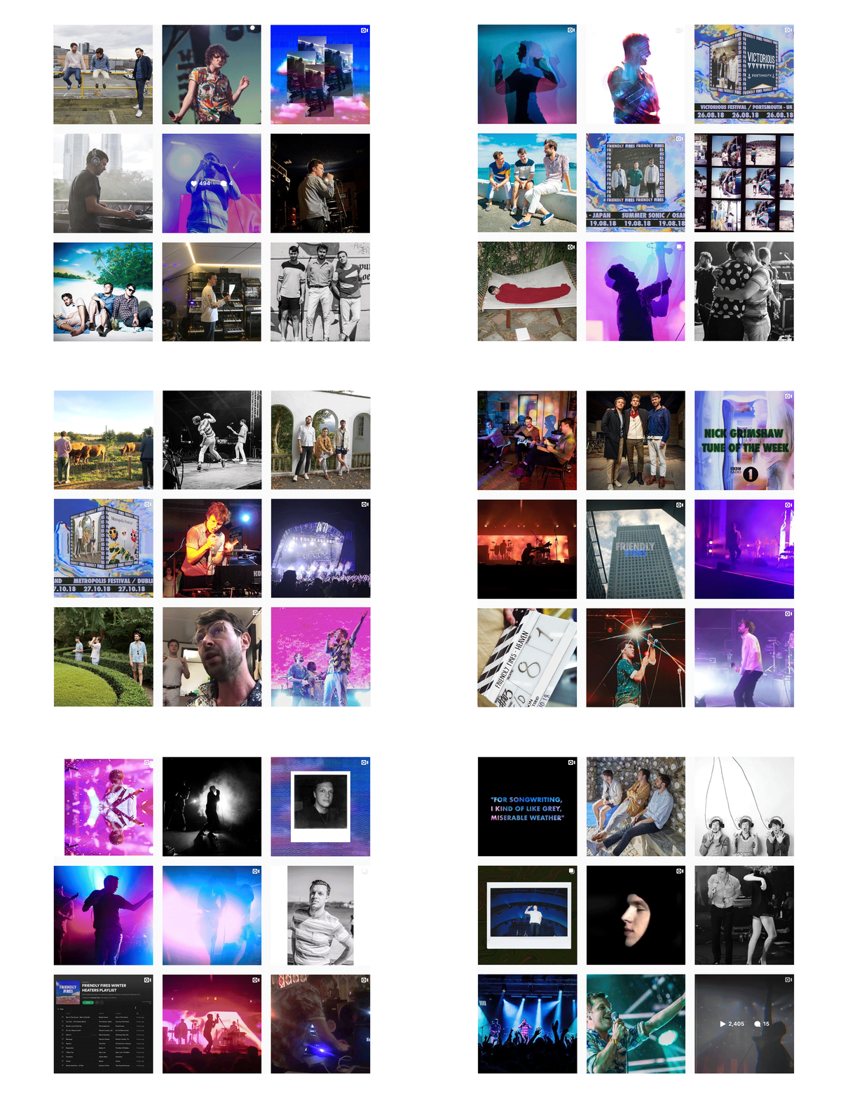
A selection of work from a range of music clients.
Hand lettered typography, video editing & animation.




Jenny Lianos
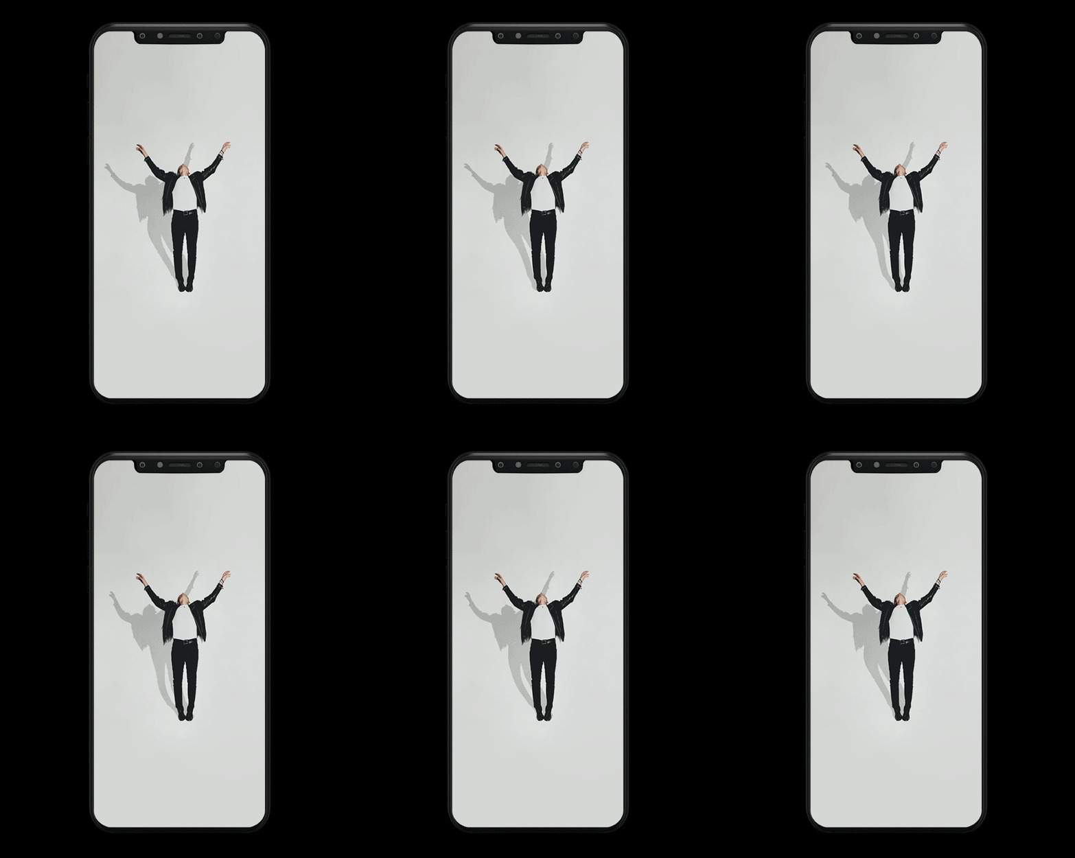
Visual identity, hand lettered text.
Inspiration
For the identity I took inspiration from Sophia Coppola’s film, “The Virgin Suicides”. I wanted the identity to represent the clients design style - cool edgy, young hip editor/ photographer. Also re-enforcing the editors working style and film knowledge, the film is acclaimed by a well known director. It was a balancing act with the type, I didn’t want it to look like a child had written it, but to have that nostalgic characteristic to the typography.

La De Da
Visual Identity.


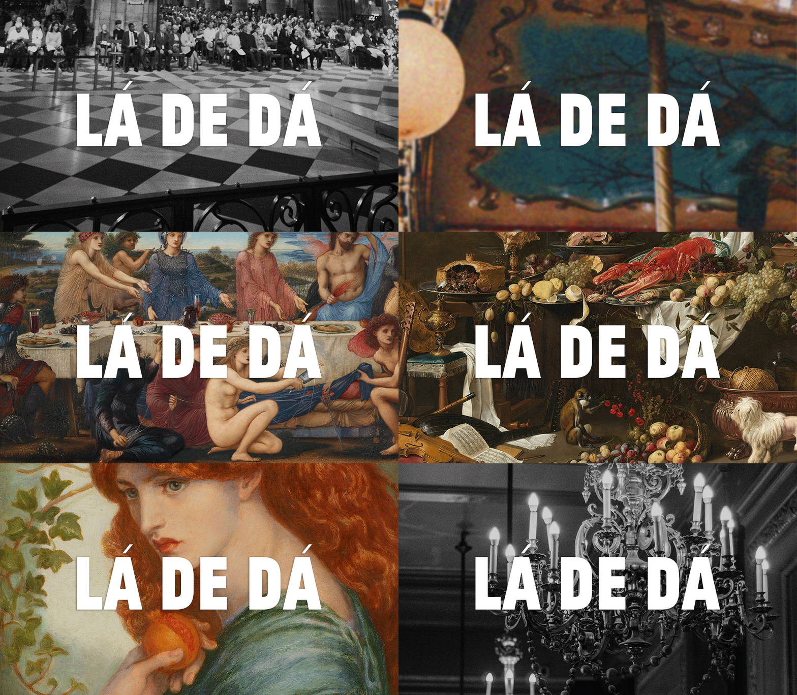

The Font
https://carvalho-bernau.com/jean-luc/
The Name
For the name, I wanted to have French connotations in the visual identity to echo the style of goods the bakery made. I used the original saying, ‘Lardy - Dah’, but using the ‘la de da’ written version so it also included the masculine and feminine equivalence of the, ‘la’ ‘le’.
I added the accents on top of the a’s to enforce the French theme and add character to the logo. Using ‘la de da’ gave the brand character and quirkiness.
The Logo
Inspired by the identity of the cafe in the film, Grand Budapest Hotel. I wanted to create something with similar attributes. I starting looking at anything cake/baking related and was drawn to a cake cloche as inspiration for the top illustration of the logo and butter curls (that you sometimes get at fancy hotels.) Butter - super important in baking.
Linda McCartney
Campaign for Linda McCartney.


I used a variety of hand lettered type to create a personal feel to the brand and also to represent what the brand stood for. I wanted to show the McCartney family’s love for the brand through the design style. Linda McCartney was a pioneer in the world of creating vegan/veggie alternatives to meat. She had a punky creative side which I wanted to inject into the brand as the majority of vegan/veggie brands have been very “uncool” and bland.
For the instagram grid we created different themes to design our posts around, for example no meat Mondays and recipe shares for Wednesday’s post. Over laid text on images made to look like recipes being handed down from generation to generation.
Inspiration posts and meal ideas all designed in the same associated style.


Emma Watson
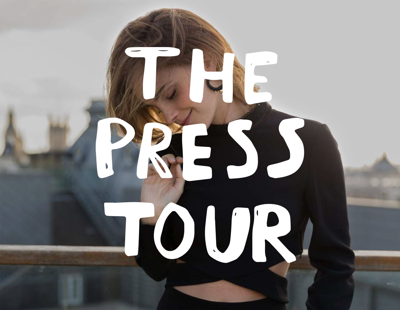
Logo.


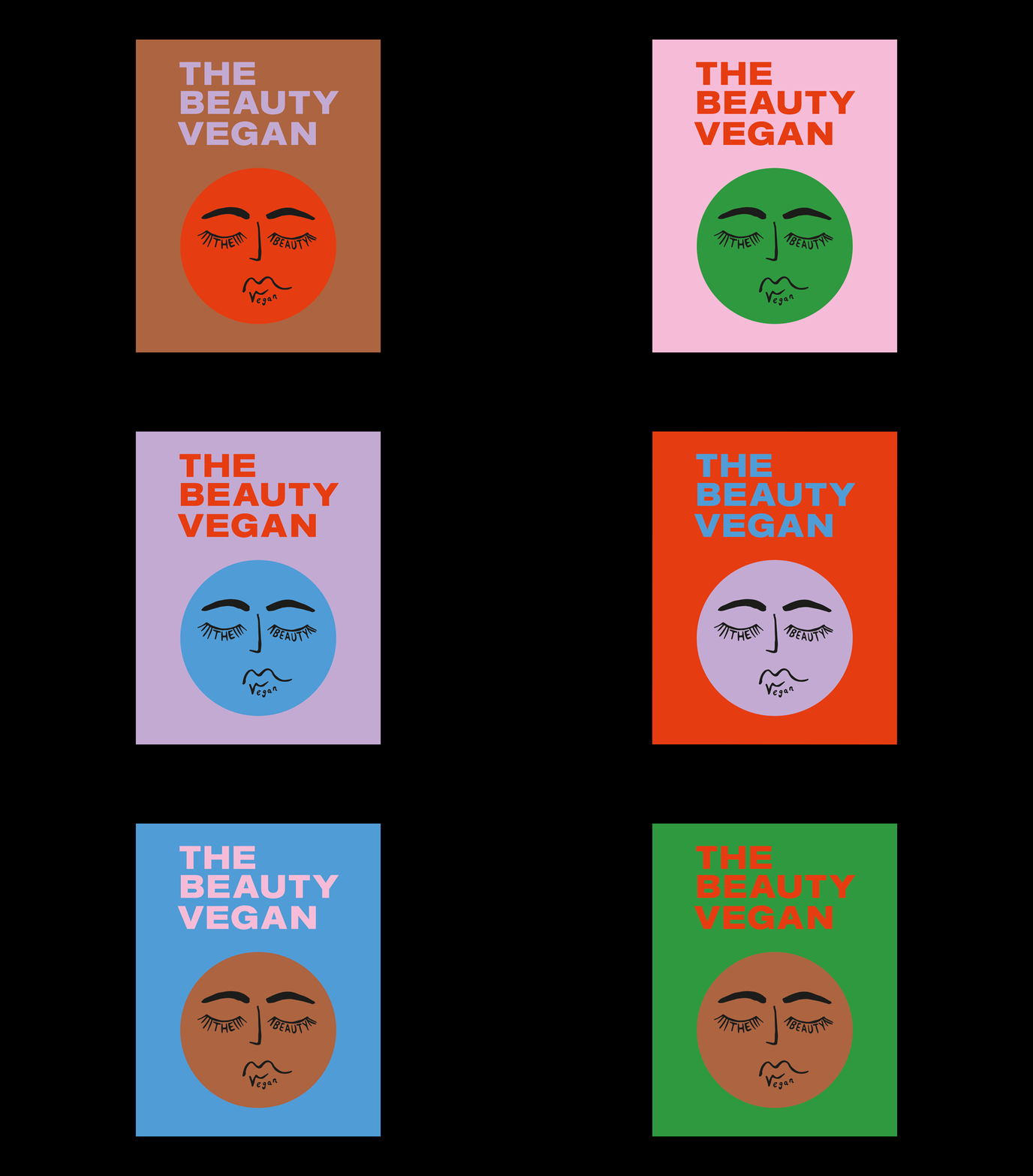
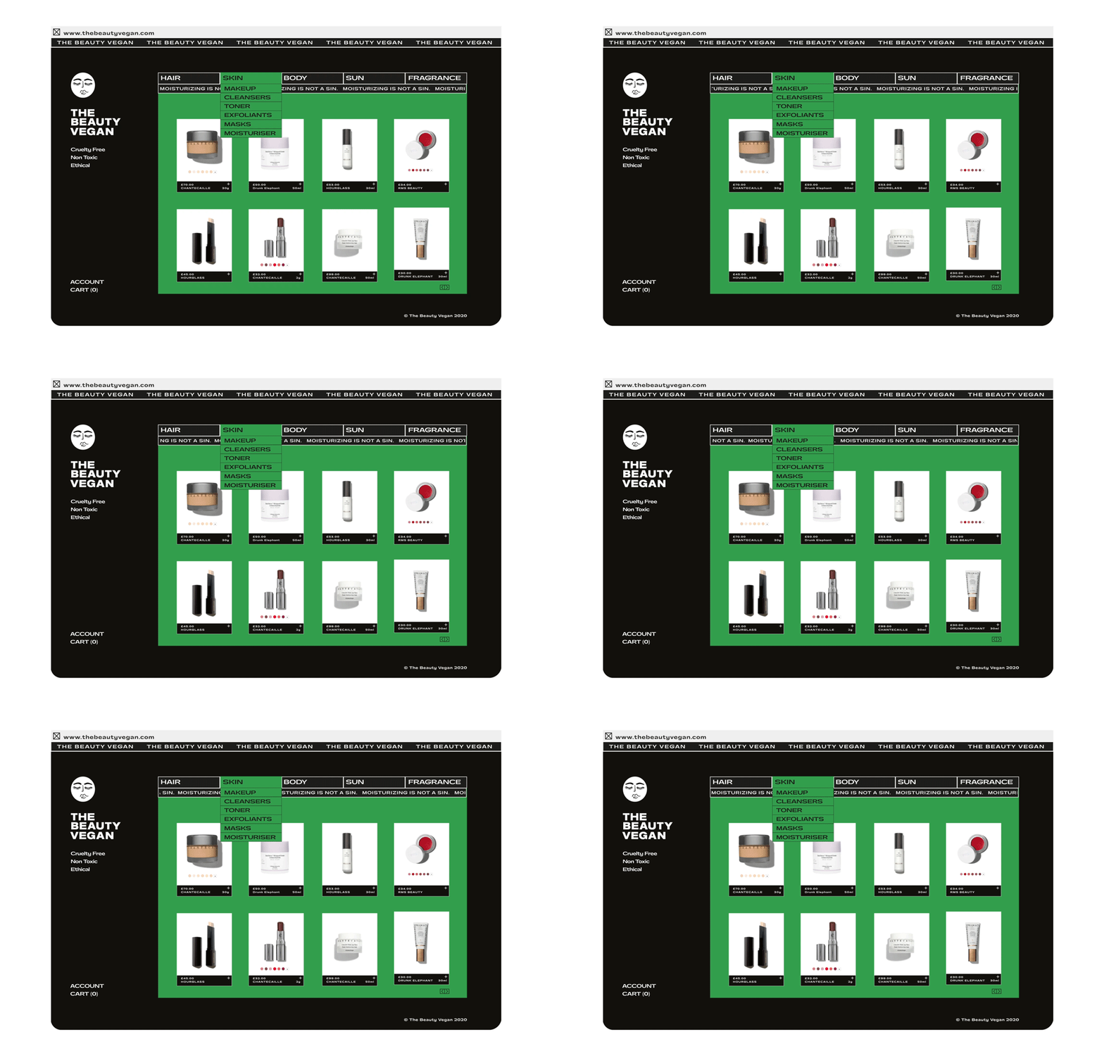
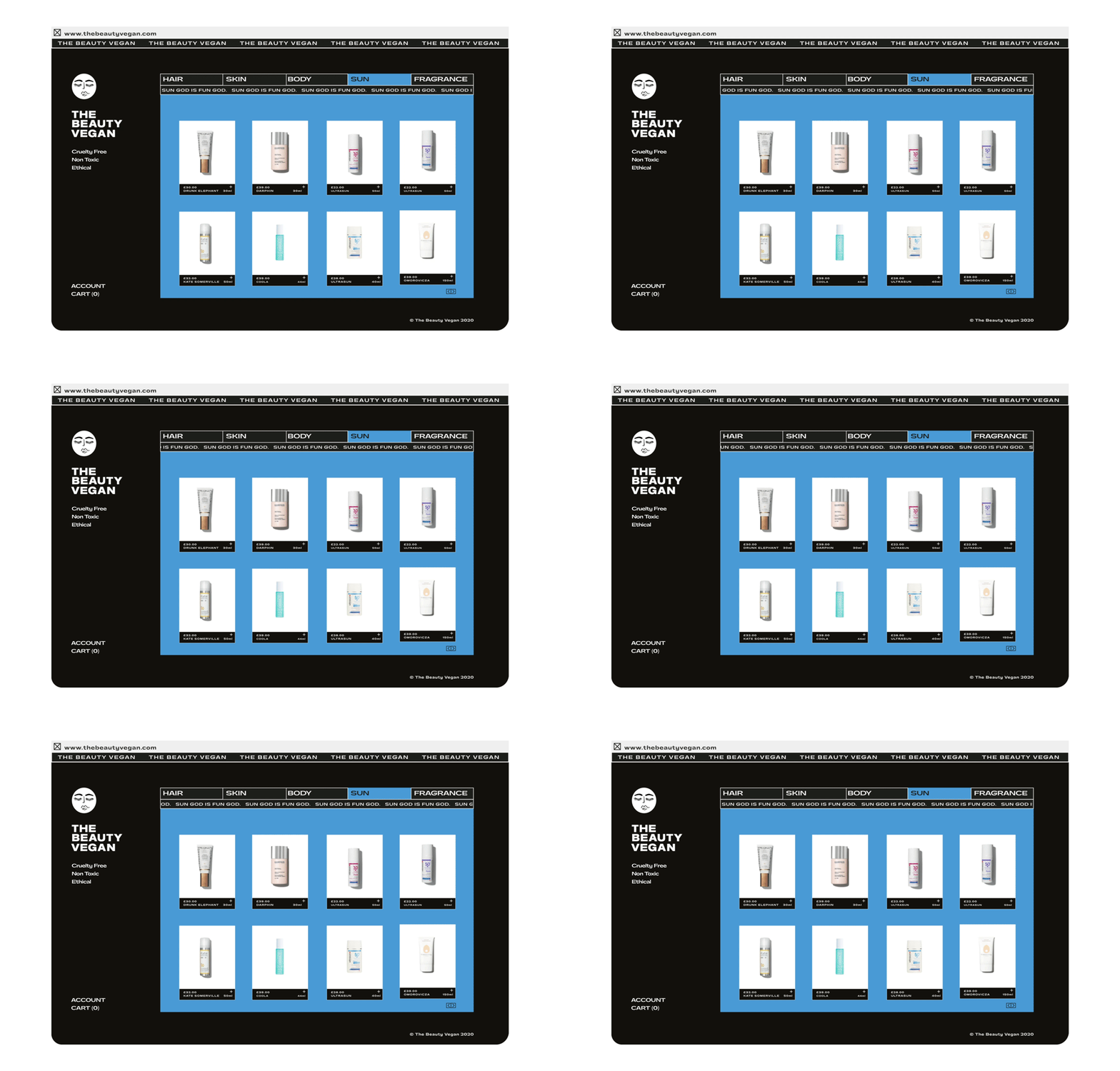
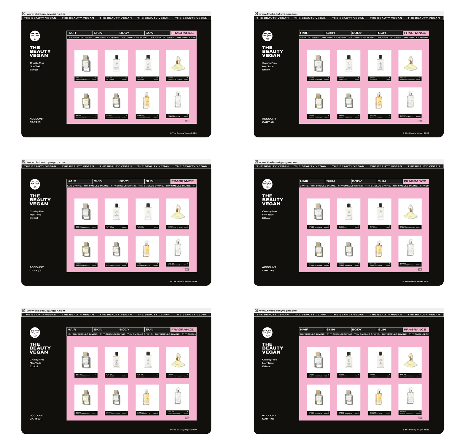
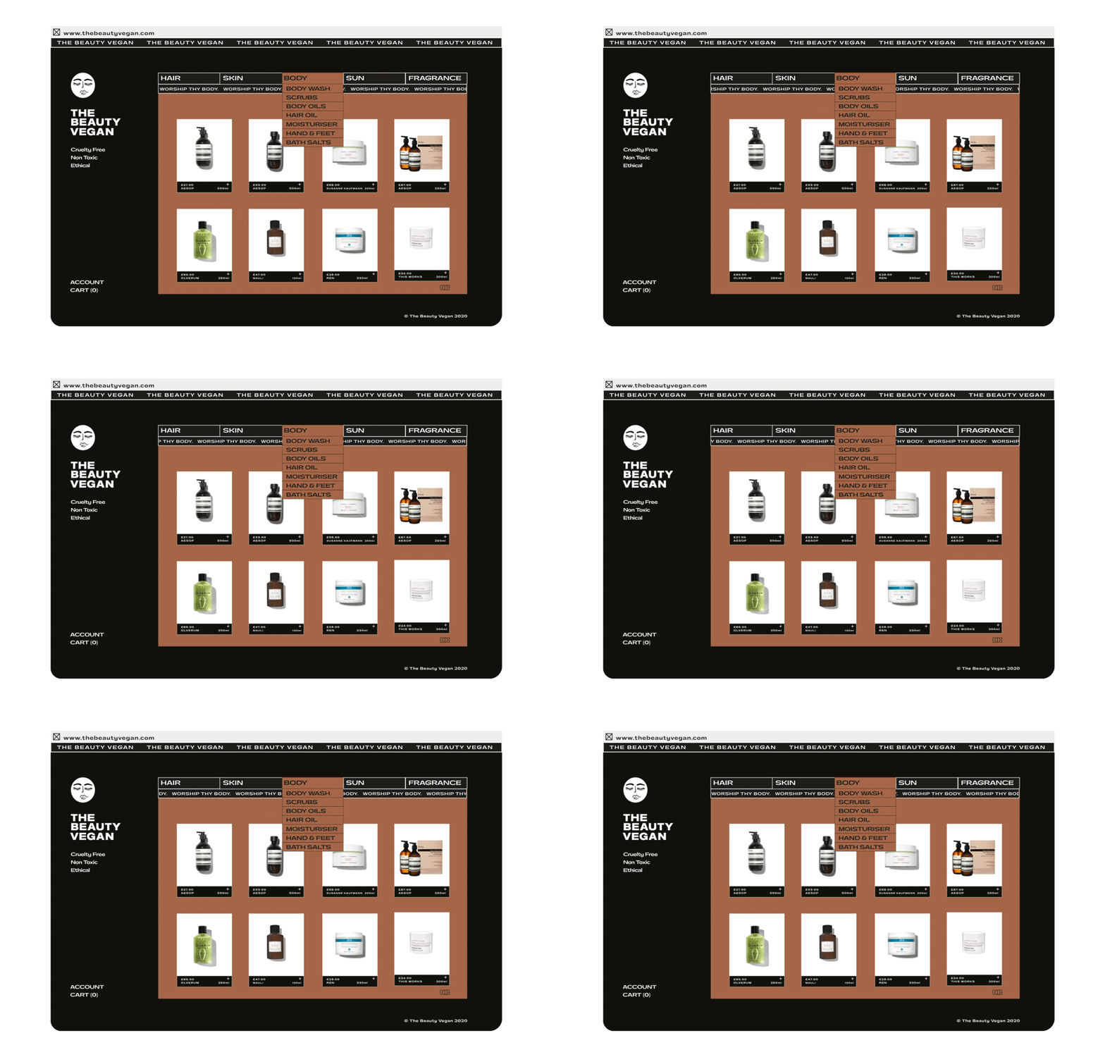
The Beauty Vegan
Visual Identity.

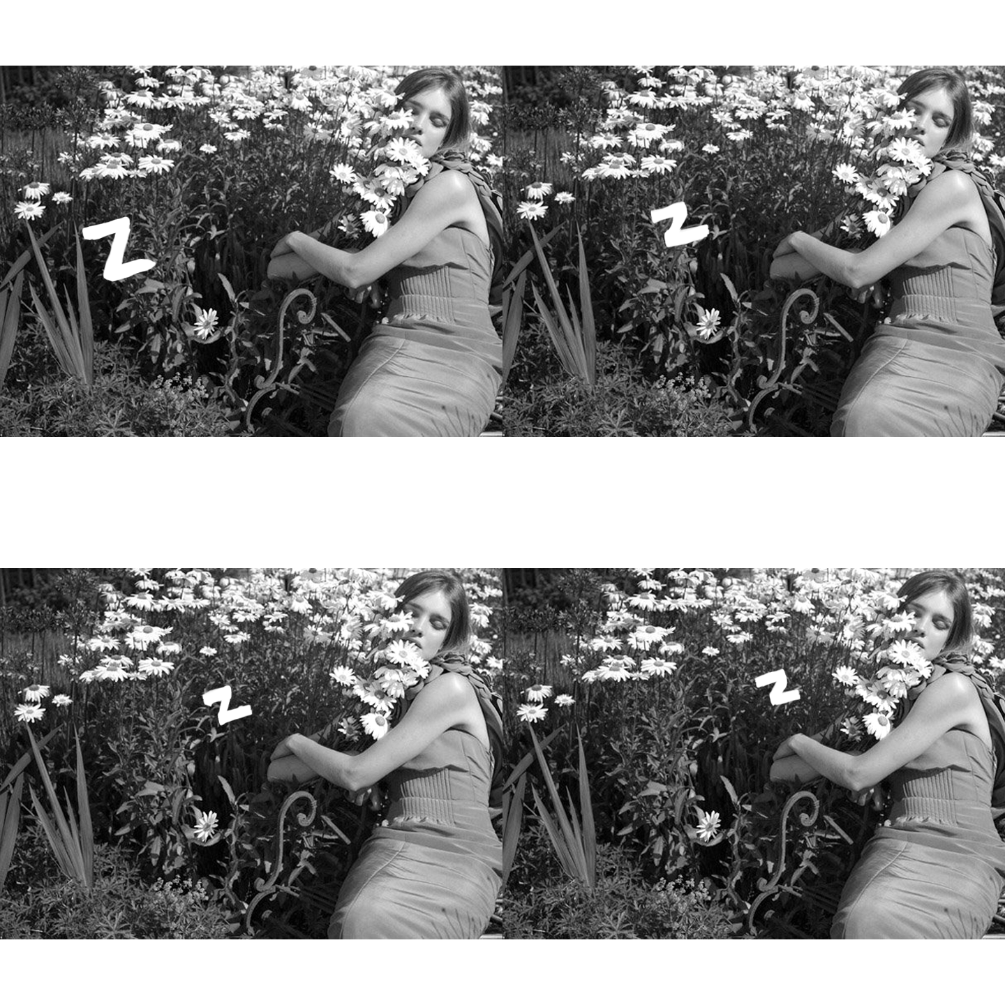
Natalia Vodianova
Campaigns and hand lettered typography.




Outhouse Films
Visual Identity.


Pay Gap
T-shirt design & campaign.


